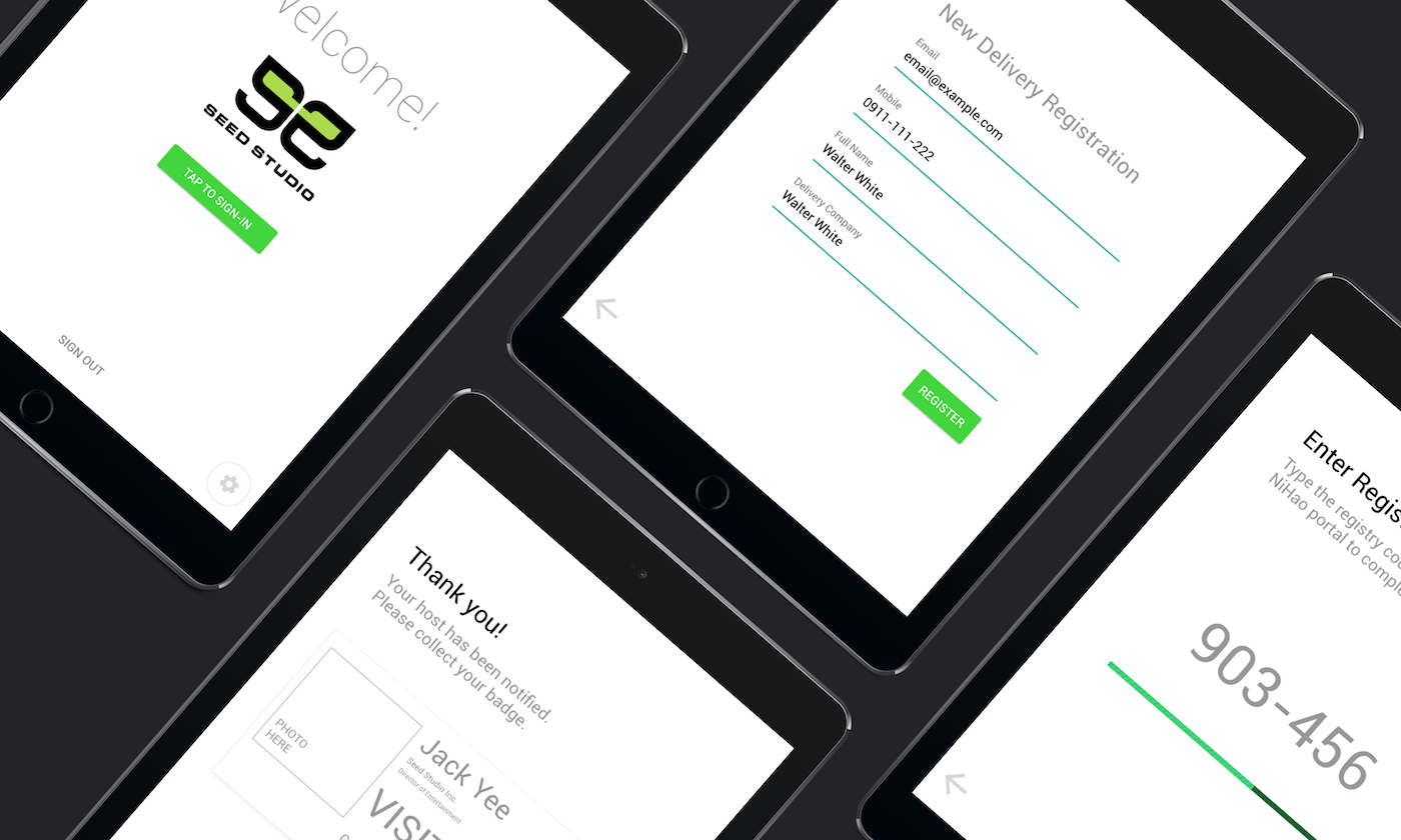
Welcome app 是一款基於大樓管理的進出系統,用戶需求建立在「方便、快速」為主,品牌設計必須要以「易讀、易懂」的方向進行
Welcome app 是一款公眾系統,產品必須適應於廣大的年齡範圍,透過 Rebranding 的方式,解決以下產品問題 :
- 一致性 Consistency: 透過統一字型、排版、配色、圖標的方式達成)
- 易用性 Accessibility: 需要建立易讀 (包含色盲模式) 的視覺標準
- 使用性與應用: 元件設計能使用於各項組件與應用的層面
商標設計
必須以「簡單、易懂」的產品名稱,同時產品名稱具有傳達產品的 Messaging 的作用,基於這樣的需求,設計方向以字體商標的方向發展
字體排版

圖標設計

易用性標準
色彩的易用標準,需建立在各種年齡層皆可以「輕易閱讀」為訴求,必須達到高對比度的視覺配置,使產品資訊更清晰易懂
色彩配置包含:
- 品牌色彩 Brand color
- 資訊色彩 Information color
- 安全色彩 Safety color
- 警告色彩 Warning color
- 背景色彩 Background color
Accessibility guideline from W3C
There is no difference between the colors) to 21:1 (the highest difference possible
Following: (Level AA)
The visual presentation of text and images of text has a contrast ratio of at least 4.5:1
The Large Text: Large-scale text and images of large-scale text have a contrast ratio of at least 3:1
Following: (Level AAA)
The visual presentation of text and images of text has a contrast ratio of at least 7:1
Large-scale text and images of large-scale text have a contrast ratio of at least 4.5:1

原版本
新版本
